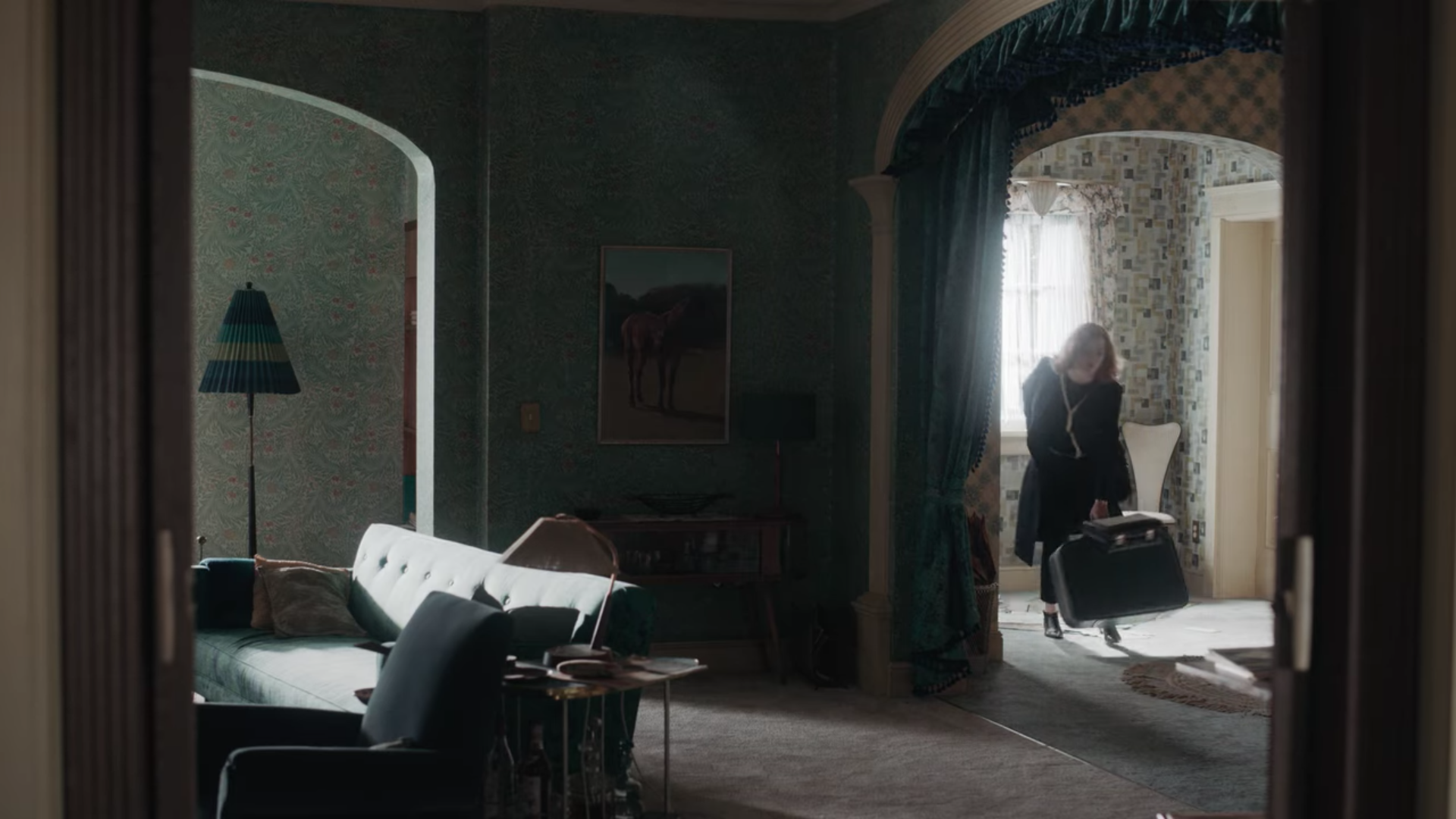
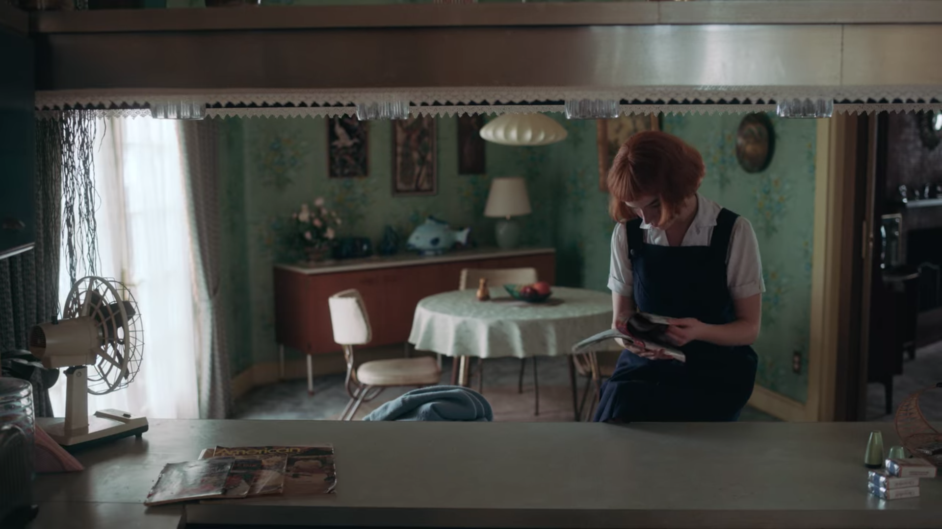
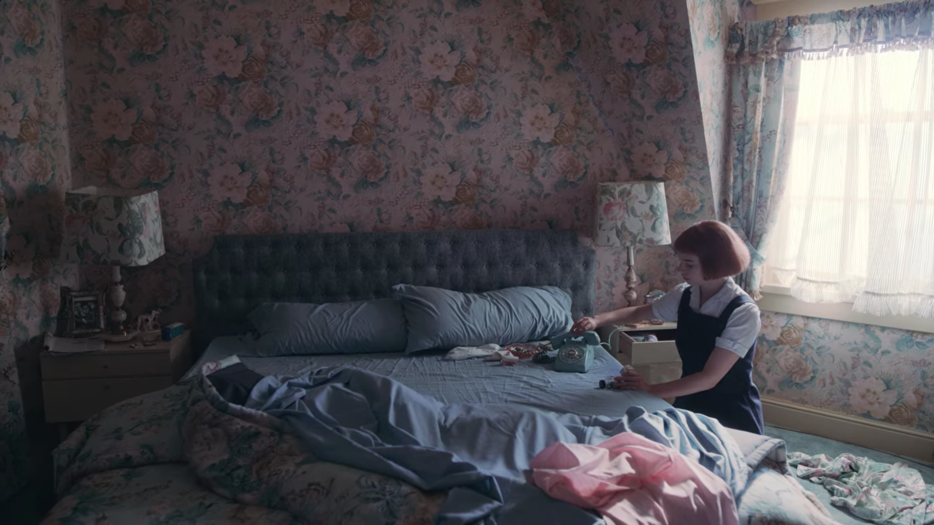
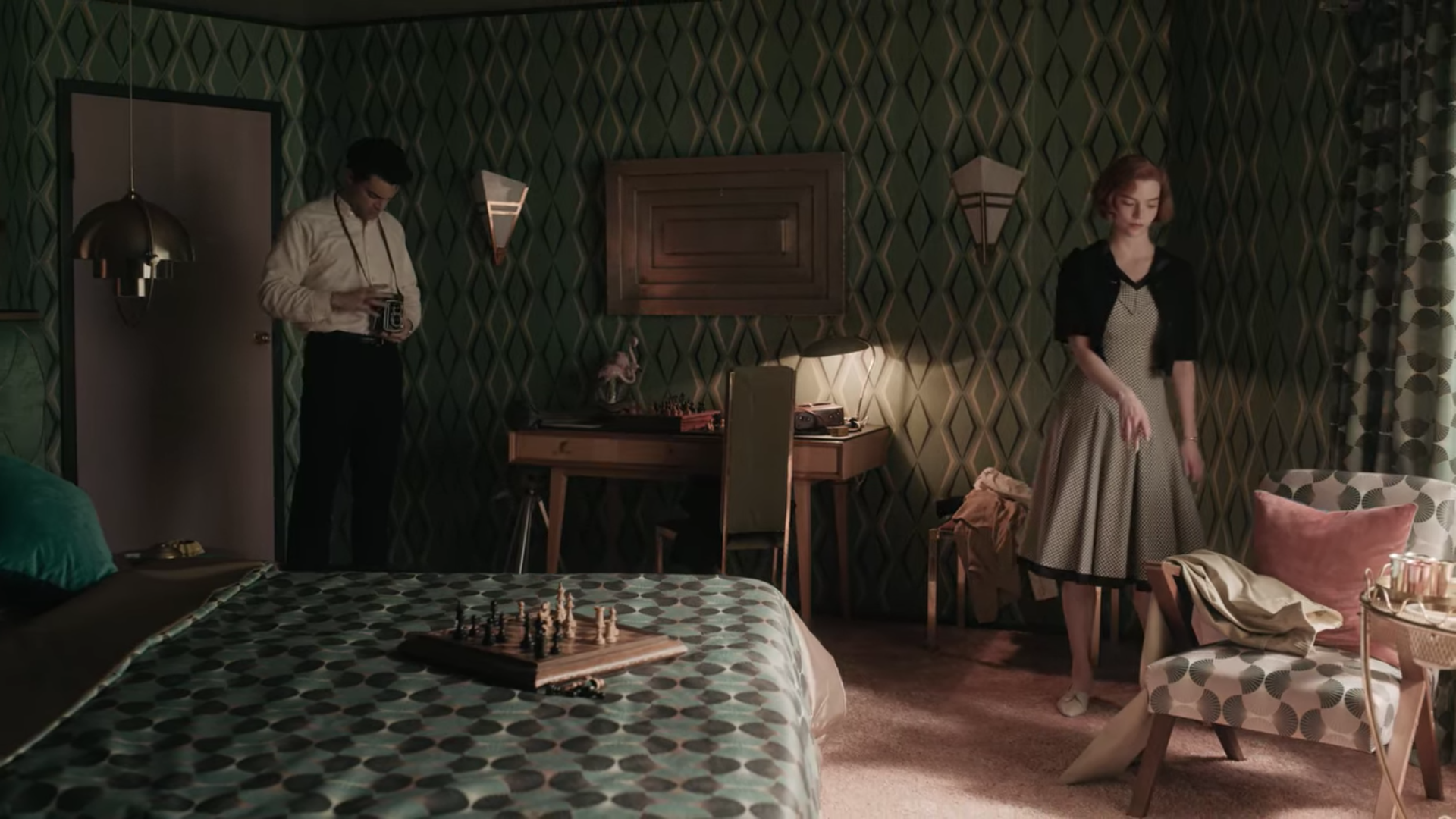
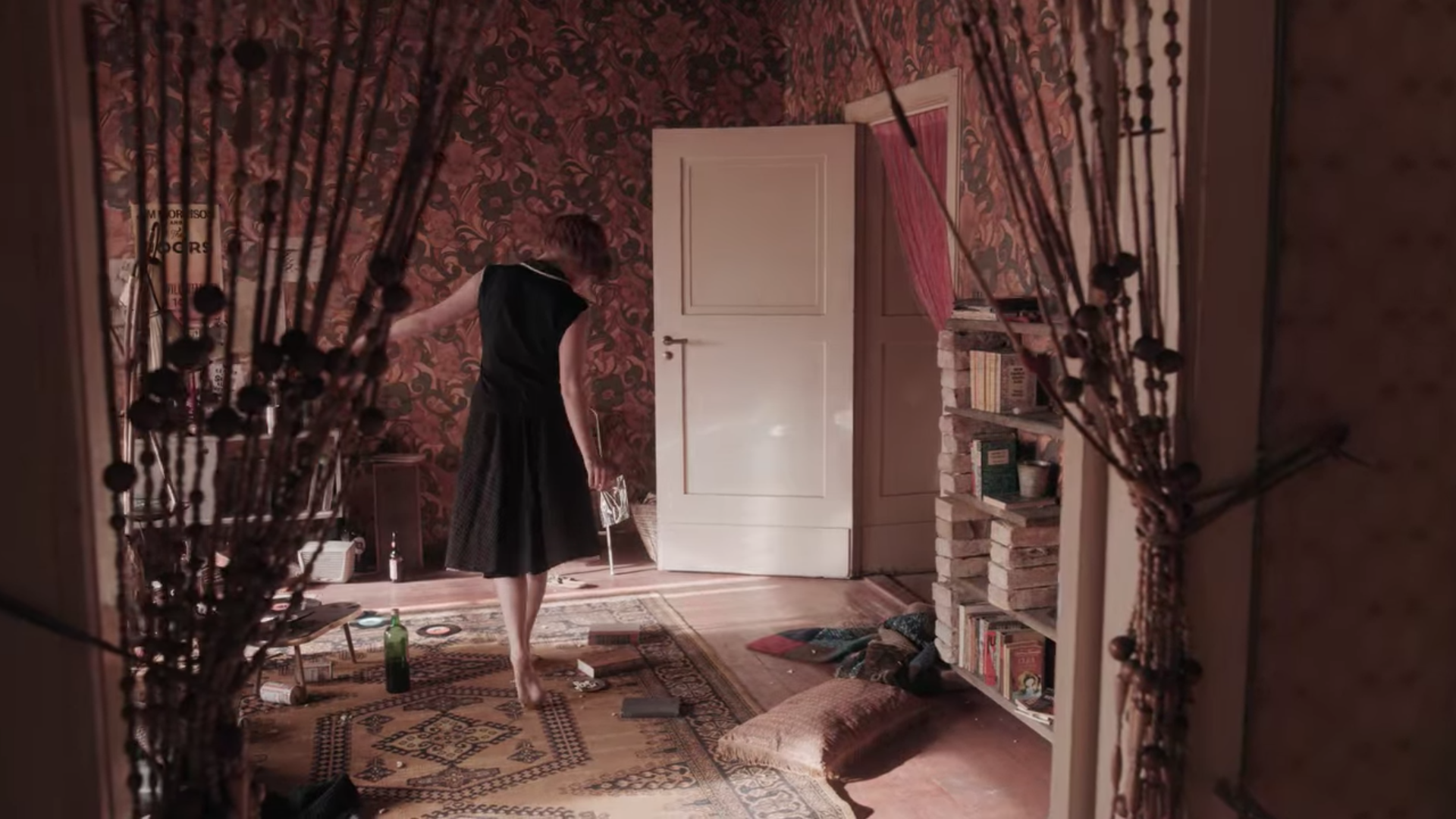
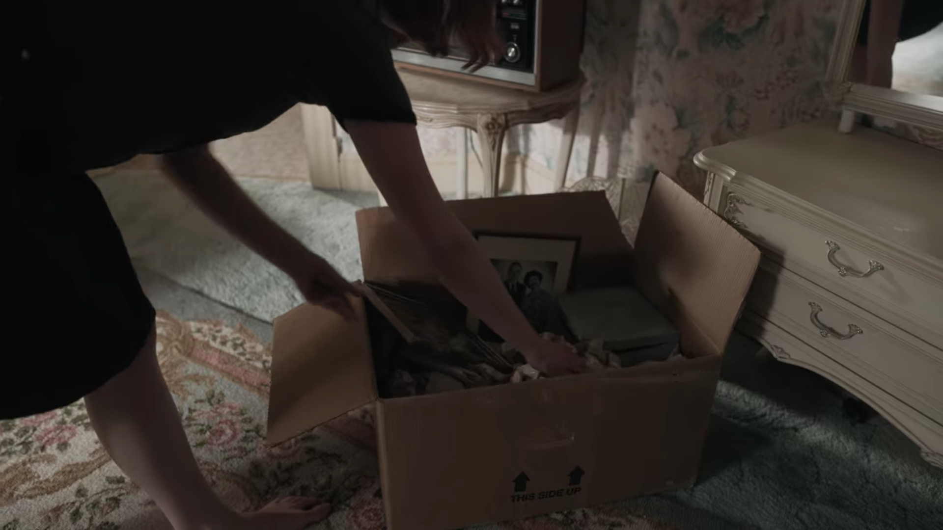
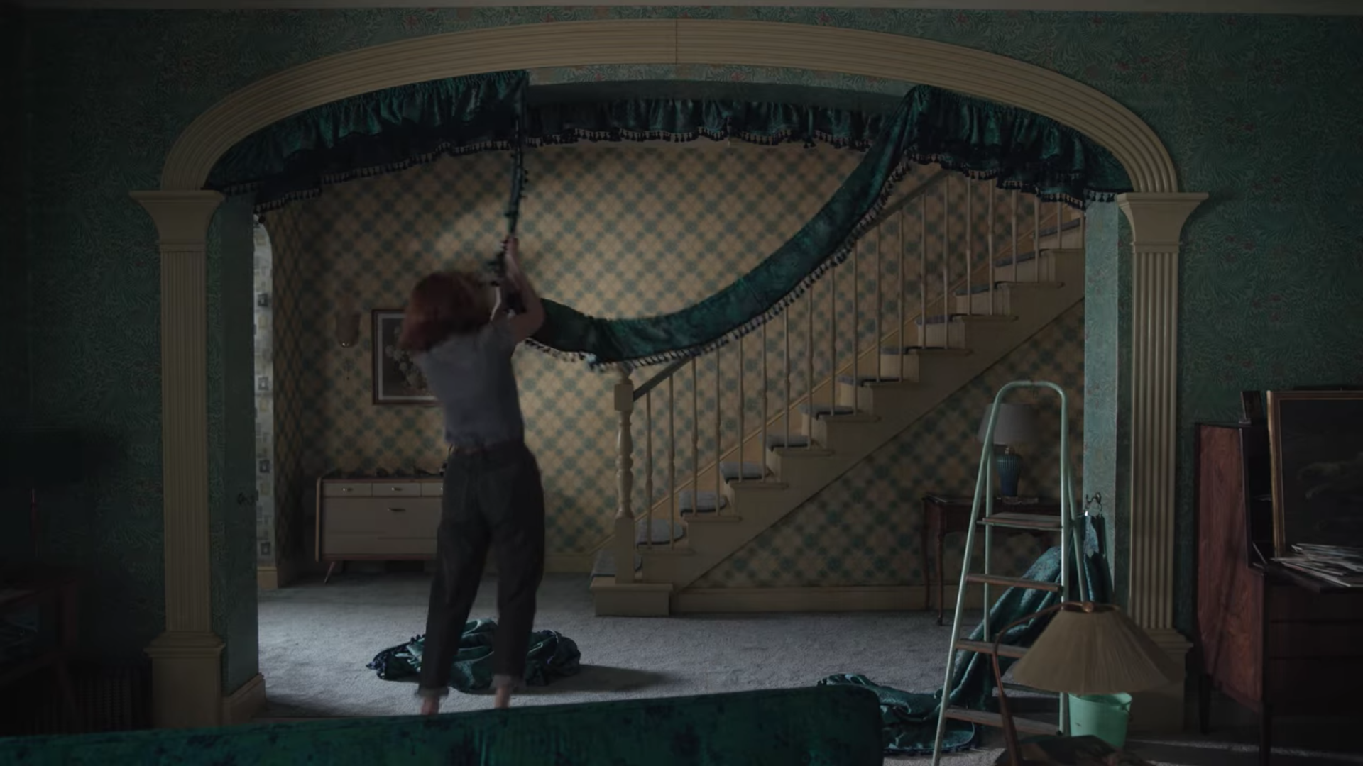
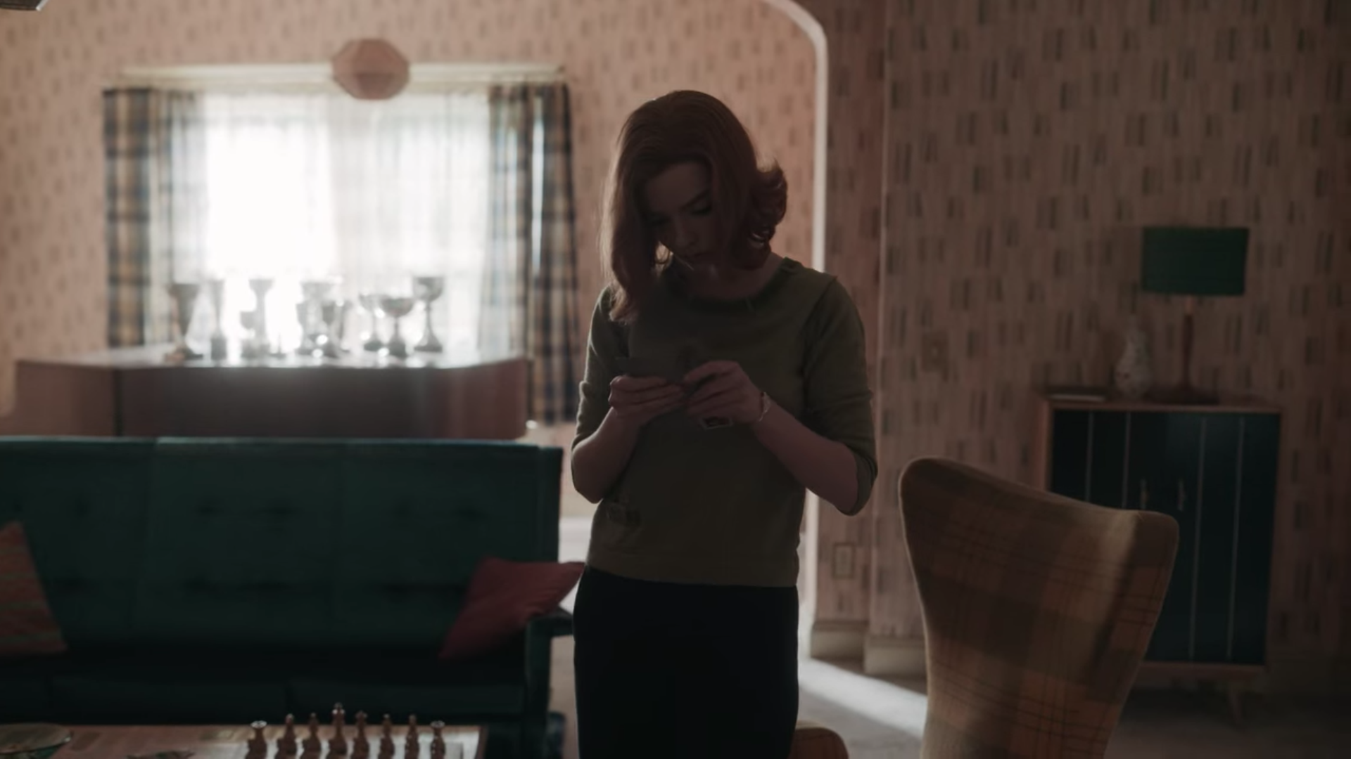
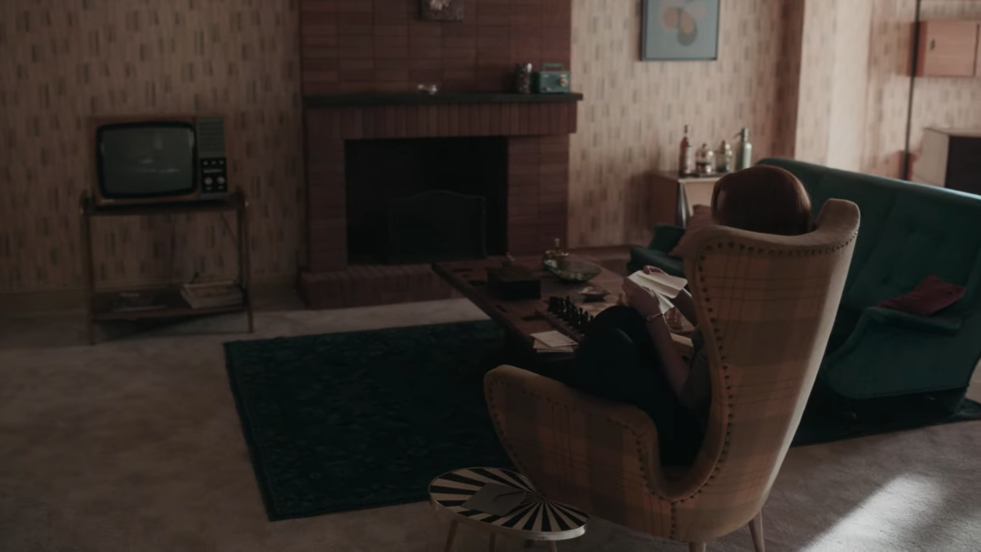
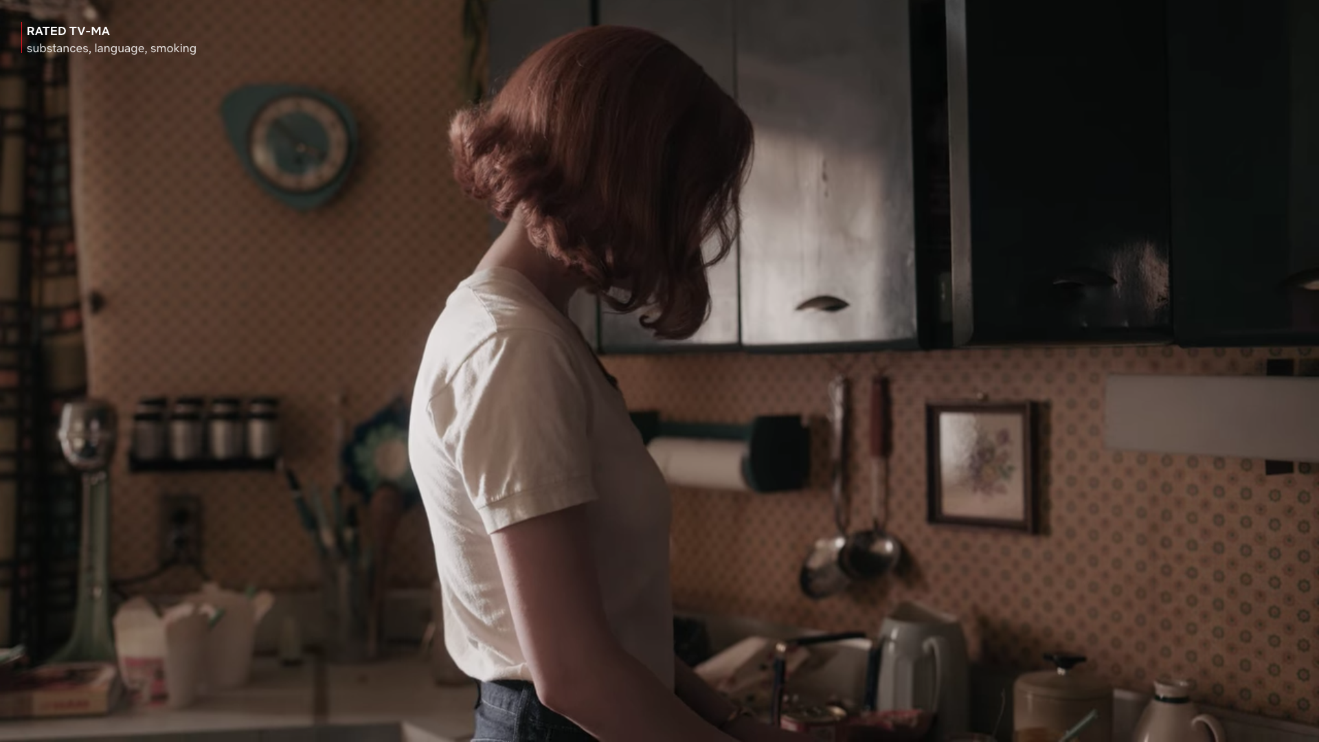
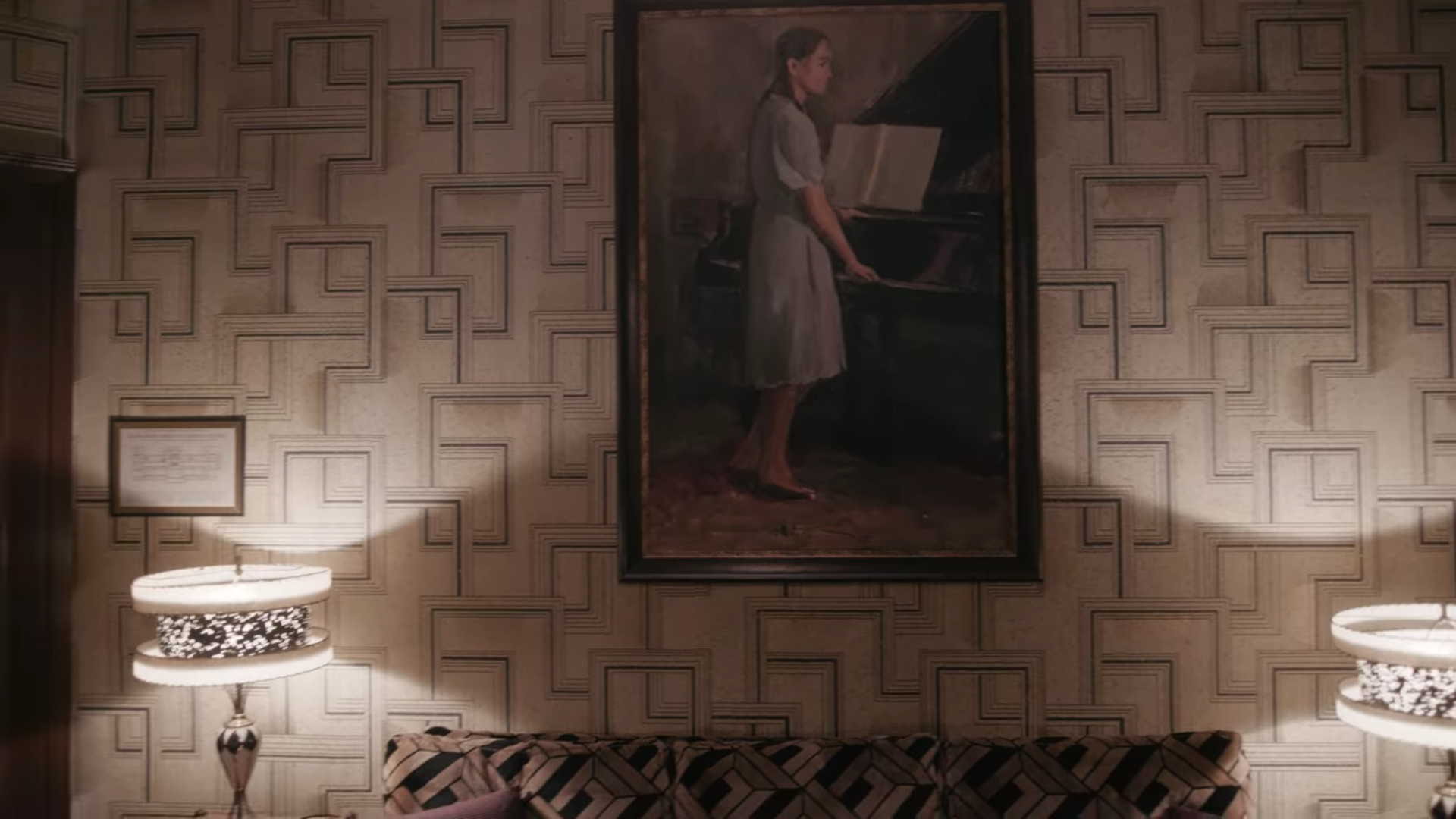
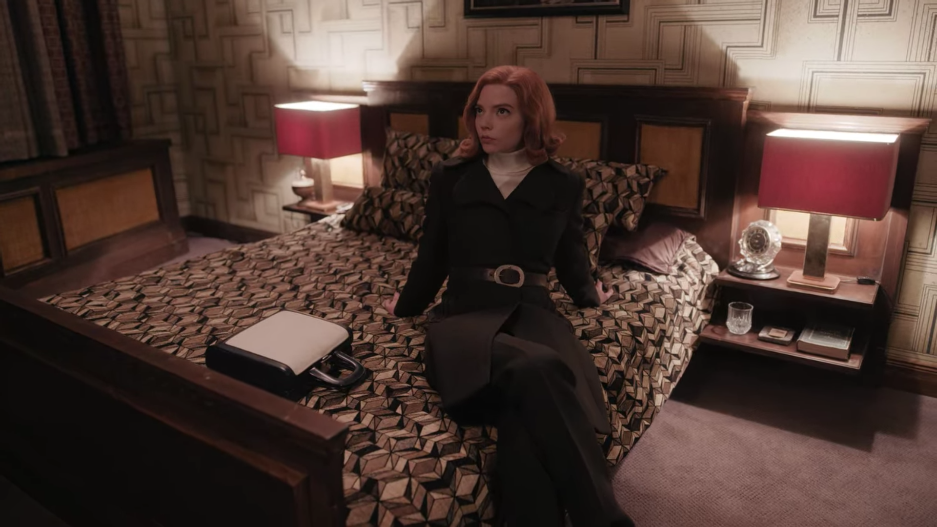
Three different great wallpapers in one shot!
Like many people, I have enjoyed the “The Queen’s Gambit” on Netflix this Fall—not realizing how invested I would be in chess competitions!
An even better surprise, however, was what a sumptuous feast of wallpaper (and costumes and hair) the show would be.
The wallpaper was truly something special though. (Wallpaper is the responsibility of the set decorator to find for sets.)
I mean how many shows can boast of wallpaper being a key visual signifier of a character’s arc and development? Plus how many shows lavish this much wallpaper upon you? (the answer to that is: “Babylon Berlin,” which is designed by the same production designer Uli Hanisch and decorated by the same set decorator Sabine Schaaf someday I’ll compile all my wallpaper love for Babylon Berlin.)
For now though, buckle in, I’m going recap all, yes ALL, the fabulous wallpaper from “The Queen’s Gambit.”
Spoilers abound.
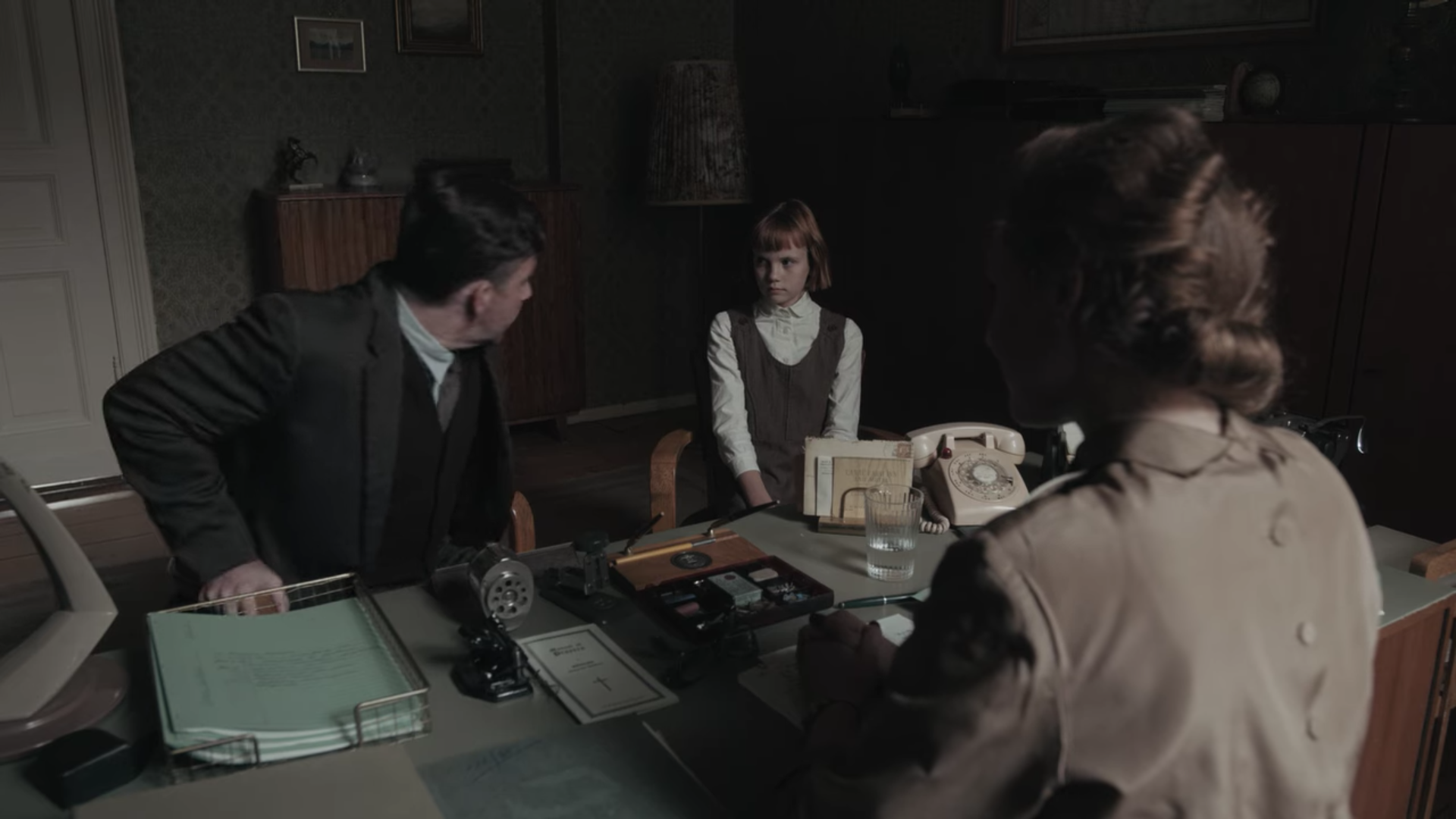
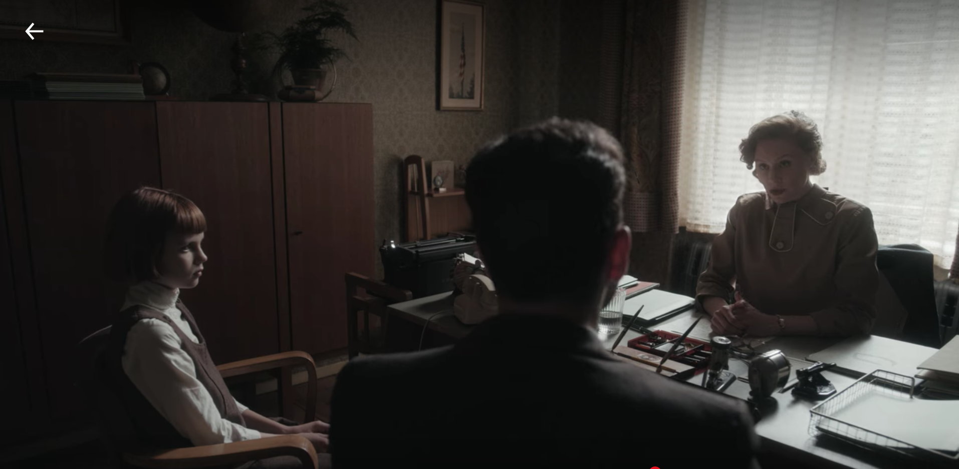
our first glimpse of any wallpaper in the whole show, in the headmistress’s office in the orphanage.
Pretty subtle tonal pattern, fitting for an institution like an orphanage, yet still a surprising and nice layer of texture on the walls where usually we expect something a little more drab.
Episode 1, was often hard to get through as it is quite dark and bleak. And just like the rest of the series, the wallpaper fun really starts picking up starting at Episode 2.
Beth’s first glimpse of her new home, the wallpaper is making a big hello.
a very pretty 1940’s style floral print in the living room that would look very on trend today in 2020.
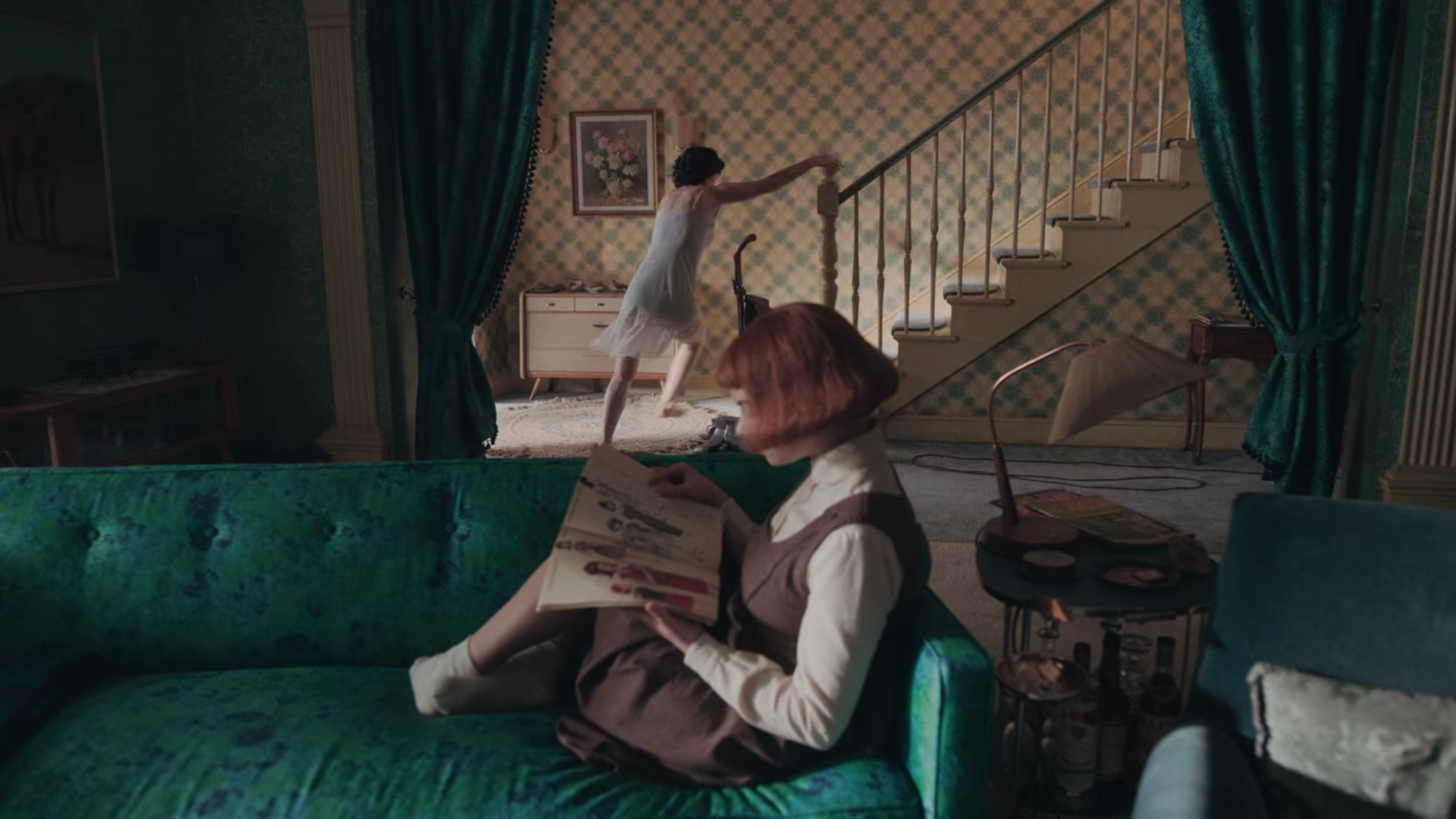
great shot of the living room wallpaper framing the stairway wallpaper
upstairs hallway wallpaper with glimpses of the master bathroom and in Beth’s room wallpapers…
great framing of Beth’s wallpaper and hallway paper, PLUS look at those two different carpets! Looks like the hallway carpet is a floral design like the wallpaper and love Beth’s textured pattern carpet + rug.
I have a theory that the plaid wallpaper is a nod to the chessboard grid to show this is Beth’s, our burgeoning chess genius, space. The plaid stands out in the mostly floral dominated wallpaper home.
just needed to highlight this fabulous couch fabric which complements the wallpaper (and matches the drapes). You can’t always see the floral print in all the shots of the couch (depends on the lighting) but this shot really shows it off. Her mom is in a hilarious body configuration of hurry in this still too.
This shot is the first time we see a glimpse (see the far left) of ANOTHER wallpaper in the entry way.
If you are keeping track at home, yes that brings our current total of Beth’s home wallpapers to SIX different designs. (…and counting)
👀 is that some fun wallpaper in what is supposed to be a depressing discount basement at the local department store?
in this shot, you get just a glimpse, but see that the pink wall complements it perfectly
ooo fun, the fun 60’s mod wallpaper layered with a mod printed fabric that’s the dressing room curtain.
the mod shape cut out for the dressing room door is * chef’s kiss .* In a scene where we are definitely supposed to be paying attention to the clothes Beth is trying on, I love that the designer and decorator still chose to have lots of fun with wallpaper and textiles to tell the story of this department store.
And we are back in at Beth’s home, another room (the kitchen) AND ANOTHER WALLPAPER!
Dining Room, and another wallpaper!!!
Beth’s mom bedroom! Look at that wallpaper and the matching curtains and lampshade!!!! And the bedspread that looks like it is the same print but the inverse colorway. omg!
A better look into her mom’s bathroom which we just got a tiny glimpse of before from the hallway.
this shot is such a great display of set decoration.
These new additions brings our current total of Beth’s home wallpapers to NINE different designs. NINE! I love that Ms. Alma Wheatley (Beth’s mom) is a maximalist after my own heart. More is more baby!
The first hotel room they stay in together when they go to Cincinnati, opening a whole new world to both of them, and oh look a wallpaper! It is a subtle and rather staid tonal small geometric pattern perfectly at home in this room.
while technically not a wallpaper, this looks like a fabric pleated wall covering, still felt important to include.
Beth escaping the home of her classmates and wait, is that? yes, it is some wallpaper in that vestibule!
I noted with interest that the home of her wealthy classmate does not have much wallpaper (except that vestibule) in stark contrast to her own home. Painted room colors, but not wallpaper. Is that a statement of the family’s differing classes? Or a statement of characters: dull and boring classmates vs. Mrs. Wheatley’s unexpressed musical talents and artistic aspirations?
LOOK AT THAT MID-CENTURY MODERN STAIR RAIL PATTERN!!!!!! (not a wallpaper I know)
Hello Vegas! You know they were having fun when doing this set. I mean look at those super fun stylized dice above the headboard and how the diamond shapes are then echoed in the vibrant mid-century wallpaper.
Leaning into Vegas’ loudness, look at this super fun and flamboyant pink hallway wallpaper we only see for a second framed by the room’s green one.
There are so many good details, like how the chair upholstery fabric is the same pattern as the bedspread and curtain but just a different colorway.
the painted diamond pattern on the closet doors to mimic the shapes of the wallpaper!
Not a wallpaper from what I can tell, but really great reflective wall texture to bounce the low light.
The opening of Episode 4 is a visual feast of a totally different vibe as we see Beth in a new milieu.
our baby is growing up, and partying with kids her own age who aren’t chess nerds.
This is the room when she wakes up in it, and the wallpaper almost disappears in the daylight whereas it was so perfectly illuminated in the candle scene prior.
we get treated to a bunch of wallpaper patterns that showcase what else was also going on in the 60’s (and then leading into the 70’s) design wise that is a totally departure from the geometric shapes of mid-century modern optimism of the west coast in Vegas.
This wallpaper (above) really is a whole groovy free-love youth culture MOOD so far from Beth’s chess world.
another bold wallpaper that Beth wakes up into.
The chess tournament in Mexico is so much about the amazing colorful Art Deco stained glass windows of the hotel location which they paired with some bold and colorful floor coverings. Since that is not wallpaper (hah) I didn’t screenshot it.
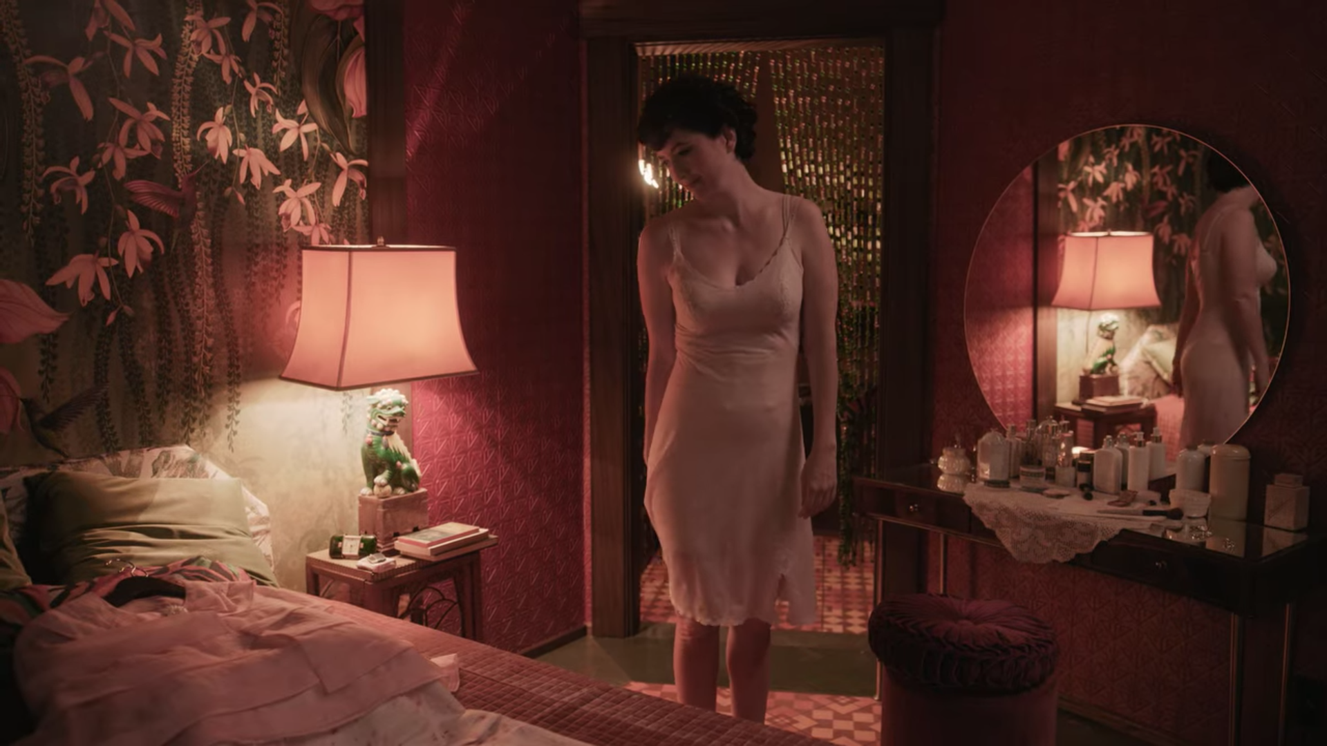
The lushness of the rich and deep colors and overlapping geometric designs contrasted with the tropical plant shapes. It is so sexy and alluring. Seductive even.
our first glimpse of the Mexico hotel room’s deep colored textured wallpaper. And the brightly patterned floor and the fun bead curtain all together is a full party.
With more light we get a much better sense of the great geometric shaped pattern of the wallpaper which I’m guessing is suppose to be a nod to Aztec geometrical motifs.
This bathtub shot is to die for. I know there’s not wallpaper here either so technically I shouldn’t be typing about it in this post, but look at that super creative vertical bathroom tile pattern! (in NYC set decorators are in charge of tile.)
back in Beth’s home in a room we haven’t seen yet: the downstair’s bathroom
Even though is a room (above) we haven’t seen yet until now, it is a wallpaper we have seen already. Remember? The entryway wallpaper we got a brief glimpse of at the edge of the shot way up in Episode 2? Since we’ve seen this pattern before, wallpaper count for Beth’s home is still NINE.
This is not an exciting wallcovering moment, but it is a moment when my husband I both said, there’s no way this building is New York City (as scripted) the stairway is way too deep. Looks much more European…say like Berlin where most of the limited series was shot?
Hahah! A set that is supposed to be dingy, spartan, somewhat makeshift bachelor den somehow still has two wallpapers. When I saw this I laughed to myself, cause I was like the designer and decorator on this show love wallpaper so much they just can’t help themselves. Which hey i’m all for!
To further my earlier speculation of the plaid in Beth’s bedroom meant to echo the grid on the chessboard I noted with great interest (and self-serving affirmation of my thesis) that the wallpaper in Benny’s bedroom (Beth’s only American chess equal) is also a plaid. …!!! you see!
Wallpaper in Beth’s fancy Parisian hotel suite
a beautiful elegant wallpaper in the hotel lobby as Beth’s frenemy gives her that destructive phone call.
ok I know there’s no wallpaper here in this shot of Beth’s Paris hotel suite, but THE WINDOW TREATMENTS! (they get more play in the opening shot of the series) Again, in NYC unlike other regions, the set decorators are in charge of window treatments too. Oh I could do a whole post on the window treatments in “Emma.” which Anya Taylor-Joy (actress who plays Beth) also stars in.
and now, the moment we have all been waiting for…* drum roll please *
THE HOME DECOR MAKEOVER SEQUENCE!
Beth is newly empowered, she bought her home outright, she’s successful and rich and what better way to assert her newfound identity and independence than by redecorating her parent’s home!
There’s nothing more fun and satisfying as a viewer than to watch a character’s story develop as manifested through a makeover sequence. Instead of all the hard, slow, and boring work we as normal humans have to undergo for a transformation of self, whenever we get treated to a montage makeover in movies or TV, the transformation is sped up into a series of quickly changing sequences that rapidly show the outer reflections of the inner work. (supposedly)
sitting forlorn and lonely in the furniture showroom. Don’t worry Beth, nothing a good new wallpaper can’t fix!
Usually it is a parade of costume changes and grooming with a new haircut, but “The Queen’s Gambit” gave us a home renovation which Beth is undertaking alone to become the grown adult woman with an identity she is creating for herself, which is just as satisfying.
our first glimpse at the new wallpaper in her home! It looks pretty similar to the geometric shapes that were there before, but it is a totally different colorway, and one of the examples featured in the home decor display Beth visits.
oooo living room wallpaper is totally redone! also in a light pink. her trophies now on prominent display. The fact that they are on the piano…showing that she is living out her passion and calling without fear unlike her mom and her piano playing?
dining room wallpaper redone! and hip modern abstract art as opposed to her mom’s old frilly landscape paintings.
you might notice that these three new wallpaper’s that Beth chose are exactly the three on display at the home decor store (see below).
Which maybe is a statement of how she wanted a change but didn’t want to put that much of an original personality spin on it preferring to just buy a display out in its entirety. Does also sound like the thing a working woman with lots of cash but preoccupied with other things (such as world chess domination) would do.
Here are some other shots of the newly made over home. Still a riot of pattern and color similar to the way her mom Ms. Wheatley decorated her home prior, just with a new more updated spin, lighter in feel, and more like a young modern woman.
look at that super fun mod kidney bean side table!
yup she bought the couch and standing lamp from the showroom. And a MCM bookcase that would look right at home in a Brooklyn apartment in 2017.
Interestingly, in the last episode (Episode 7) we see the rooms that Beth doesn’t makeover: the kitchen, her mom’s bedroom, and her mom’s master bathroom.
It seems to make sense that she would want to hold onto some parts of the home that remind her of her mom and ground her in those years with her. (that’s how I’m reading it).
It also could be by the time she got to the kitchen she realized how expensive it is to totally redo a kitchen and decided she couldn’t be bothered for the meantime (haha relate.)
ok everyone, we made it to the final wallpapers of the season: this fabulous geometric one in Beth’s Russian hotel room.
oooooooooooOOOOO look at those matching bedside table lamps!
What I love about these two images above, is how the geometric wallcoverings in that long hallway ( I suspect they had a lot of big paintings to cover and fabric was the easiest clearable solution) are echoed in the geometric pattern of the bedspread, and in sync with the color palette and geometric angles of the wallpaper, and her final windowpane coat!
All this geometric angular black and white remind you of anything?…SAY A CHESSBOARD????
oh wait, the last and final wallpaper is actually the plaid one in the background of Jolene’s office. hmm with my plaid= chessboard theory I wonder why this is then associated with Jolene? (can’t quite figure it out)
WALLPAPER COUNT: 28 total!
So for all my rhapsodizing of the FABULOUS and wonderous wallpaper and general design and decoration of “The Queen’s Gambit,” I have to say my number one disappointment in the series is how they treated the character of Jolene.
As I watched Jolene’s reappearance in the final episode I was like “Noooooo please don’t tell me they are…” ….sigh, they really are using Jolene as a stereotypical flattened out Black best friend archetype whose only real purpose is to care for our (white) protagonist and help her overcome her demons. Sigh.
Well fabulous wallpapers or not, we all know Hollywood has a LONG way to go in doing non-White characters justice on screen, which is precisely why I wanted to get into set decoration: to merge my love for decorative arts and design with the desire to help authentically and thoughtfully create sets for underrepresented characters on screen.
